The story of Reebok's 1997 Instapump Fury
Design Ideas and Random Thoughts
Read Time: 4 min
Wise words:
“When everything is urgent, nothing is truly important”
– Derek Thompson, staff writer at The Atlantic and author of Hit Makers: The Science of Popularity in an Age of Distraction believed that tearing down oppressive systems was the first act of true creation.
Made me think:
🧠 Positivity Bias
Our instinct to overestimate the likelihood of good outcomes. In design, it fuels progress — the belief that we can build a better shoe, system, or world — even when evidence says otherwise. (Thats why I think kids are the best designers, they aim high!)
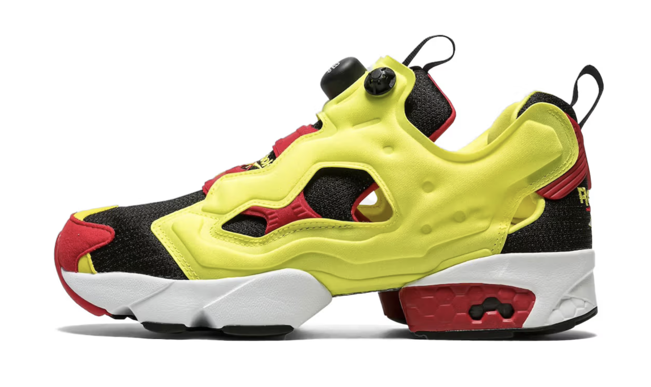
Reebok's Instapump Fury — When Futurism Met Footwear.
The Reebok Instapump Fury wasn’t a happy accident — it was the result of a bold creative experiment inside Reebok’s Advanced Concepts Group, later Reebok Advanced Concepts or RAC to avoid confusion with Nikes ACG (see our post on Nikes Secretive HTM lab). This team, working separately from the main brand, became Reebok’s secret innovation lab — a place where rules were suspended and ideas were allowed to misbehave.
The original idea for The Pump was anatomical: no two feet are the same, so why should shoes be? The answer was air. Pump technology allowed each foot to be surrounded by air chambers that could be inflated to the wearer’s exact shape — a form-fitting revolution.
Then came CEO Paul Fireman’s vision — literally. During a meeting about the 1992 Olympics, he imagined an athlete at the starting blocks stopping to inflate his spikes before winning gold. He turned to the design team and said, “Go do it.”
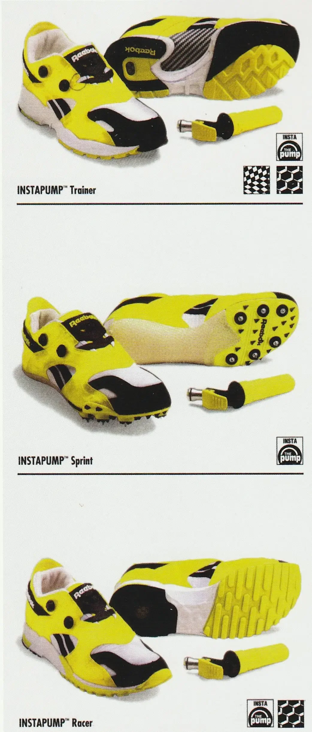
That dream became The Instapump System — an evolution of The Pump. It used a CO₂-powered inflator gun (shaped like and inspired by a mini Star Trek phaser) to inject air into the shoe’s bladders. The RAC team built three early models: the Instapump Trainer, Sprint, and Racer. But one design — the Fury — became legend.
The 3 early insta pump models and hand pump
Steven Smith, working alongside Pump inventor Paul Litchfield, decided to expose the technology. Rather than hiding the inflatable system, he stripped away overlays and left the air bladders visible. The result was the Instapump Fury — more machine than shoe. Inspired by Bauhaus principles, Smith saw it as a complete ecosystem where removing a single part would collapse the whole.
Visually, the Fury was as bold as its concept. The lines nodded to Smith’s earlier design — the New Balance SuperComp (1977) — and the colourway borrowed from the Sex pistols album cover: “Never Mind the Bollocks”. The sales team panicked at the neon citron and red, insisting on a safer palette that history quickly forgot. The punk version survived — and became iconic.
Carbon plate detail joining the two soles
Technically, the Fury was radical. It replaced the 150-piece construction of traditional runners with just 25 aerospace-grade parts. The carbon fiber plate, Graphlite, was exposed beneath the sole for structure — a decision that predated the carbon-fiber revolution by decades. Its air bladders were co-developed with Dialetrics, a medical company specialising in IV bags and life vests, while the Hexalite cushioning was inspired by the material in helicopter rotors.
Reebok’s marketing team didn’t know what to make of it. “Too weird,” they said. But when Jackie Chan wore it in Hong Kong, it exploded across Asia. A 2003 Chanel collaboration cemented it as a high-fashion icon, years before luxury sneakers became a thing.
And while it flopped commercially at first, the Fury’s legacy only grew — from Björk to Boris Bidjan, from Maison Margiela to Vetements. Even today, Steven Smith jokes that he’s “still waiting for someone to design something more futuristic than the Fury.”
It makes me think, what current flops are tomorrows hits? and what changes to make them so. Sometimes I think it's because they're flops that people adopt them years later...
My Recommends this week:
📘 Schott’s Significa: An Unexpectedly Essential Guide to Language
From one of my favourite bookshops, Toppings of Bath, this gem is a secret map of modern jargon, lingo, and linguistic quirks. Ben Schott uncovers the hidden codes behind everyday language — from military slang to marketing buzzwords. For those of us immersed in sneaker culture, it’s a reminder that every subculture develops its own dialect — “hype”, “drops”, “grails”, “heat” — a language that defines identity. Thanks J.S for the gift!
👉 Check it out here
🧠 BioDigital Human
An extraordinary free 3D interactive model of the human body that lets you explore muscles, bones, and motion. For our current footwear comfort project, it’s a goldmine — a way to understand the true 3D geometry of the foot, the tendons at play, and how motion maps to pressure. Think of it as anatomy meets digital design.
👉 Check it out here
👟 Footwear Prototypes
For a deep dive into innovative footwear design where I share original concepts, explore unique shoe materials, and discuss design strategy—all curated for anyone passionate about shoemaking, luxury design, and seeing fresh stuff, check out & follow my LinkedIn feed


